I think learnt a great deal from my preliminary task. From the first task I learnt that I needed to create a masthead that would catch peoples eyes, that was easy to remember and that ties in with the theme of the product. I also learnt that I needed a more interesting product that would stand out from the conventions often seen in magazines especially in the age group I was targeting.
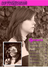
I learnt that I needed a more striking picture as in the preliminary I had a quite plain picture which did not really draw in readers and therefore made the magazine look a little boring, the model I used also fitted the conventions of a stereotypical teen magazine and therefore looked like many other magazines and did not look any different, because of this I took a different style of picture that challenged the conventions.
I also learnt that I needed to add a drop shadow to make the writing stand out and to look more professional as in my preliminary task the front cover looked boring and looked like a flat image.
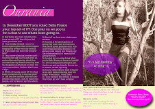
I think my final finished product is a great improvement from my preliminary as I had something to compare and improve from. I also used my research (questionnaire and deconstructions) to alter my product.
Subscribe to:
Post Comments (Atom)

No comments:
Post a Comment