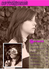
I believe my product both challenges and follows certain conventions of music magazines; I believe that my magazine challenges the stereotypical conventions, as my magazine is based on alternative music and does not conform to the 'pop' style of music that is often in the music charts. My magazine is called revolution, which connonets that people buying this magazine do not conform to the usual stereotypes of music, Revolution means radical change connoting that the magazine is a change to the normal type of music and magazine.
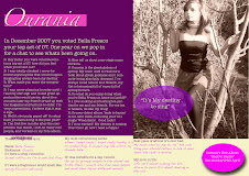
However in some ways my magazine does conform to the conventions of a music magazine, particually ones that are aimed at teenage girls, because the font of the word 'Revolution' looks very feminine as it looks natural like flowers. The masthead is also pink, the theme of pink, cream and purple run throghout my Cover, Dps and Contents, which also conforms to the conventions.
I have also followed the conventions by the way i have set out the pieces. For example on the front cover all of my text is on the right handside with the masthead at the top of the page, following the style of many other popular magazines. i did this because as my target audience was a niche audience i still wanted it to look like a magazine so pepole would not be put off by the fact that it was different to others.
Subscribe to:
Post Comments (Atom)

No comments:
Post a Comment